





Mobile Version
Responsive email already includes a mobile version. It is created by adapting the desktop email to give the layout a cleaner, more readable structure that feels more natural and comfortable on smaller screens.




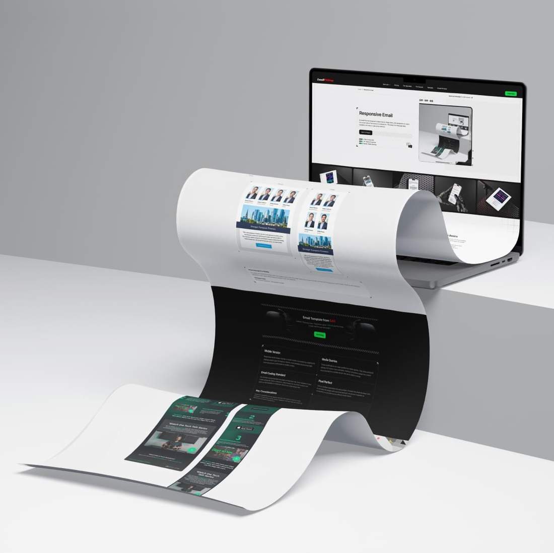


Modern email coding goes beyond making a layout simply responsive. It is about building flexible email structures that adapt content, spacing, typography, and images for smaller screens while preserving the intent of the original design.
When an email is hand-coded from scratch, each section can be shaped with much more precision for mobile viewing. Content blocks can be reordered, text styles refined, spacing adjusted, and selected elements hidden or swapped when the layout calls for it.
This level of control makes emails easier to scan, clearer to read, and easier to engage with across devices. It also enables responsive behaviors that standard email builders often do not support or offer only in a limited way.
For companies, this means more than a better-looking email. Well adapted responsive emails present key content more effectively, improve engagement across devices, and give campaigns a better chance to achieve their business goals.

Explore responsive email techniques that improve content flow, readability, and layout control on smaller screens. From reordering and typography to spacing, hiding, and content swapping, these adjustments help create a clearer mobile experience with more control than standard email builders typically allow.
We can stack, reverse, or reorder content blocks for mobile, so your email stays clear and easy to follow on smaller screens. This helps present the message in a logical sequence, making it easier to read and understand.
Spacing matters just as much. By reducing padding and margins, we can make content more compact on smaller screens while preserving the overall proportions, balance, and visual consistency of the desktop design.
In responsive email, text is usually readable on mobile, but when needed, we can refine typography for smaller screens by increasing font size, adjusting line height, and using font weight to add emphasis where it helps.
We can resize images for mobile or make them fully fluid to fill the available width. The same applies to background images, which can also be adjusted and optimized for smaller screens when needed.
Hiding elements in the mobile version, whether images, text, or entire blocks, is a useful way to simplify the content flow, reduce visual clutter, and present the message more clearly on smaller screens.
Swapping images, text, or entire blocks, including informational tables, gives you more flexibility to shape the mobile version around the right content flow rather than follow the original desktop structure.
See how real email sections are adapted for mobile through hand‑coded responsive techniques. Each example shows the desktop and mobile versions along with the techniques used. Some of these techniques are not supported in standard email builders, while others offer only a much more limited level of control.












On mobile, the leadership profiles shift from a four‑column row into a two‑by‑two grid, giving each profile more space and making the top section easier to scan. The lower content keeps its stacked structure, with the city image followed by the headline band, slightly larger body copy, and CTA, while spacing and proportions are adjusted for a cleaner vertical flow. The text block is slightly narrowed and centered, helping the layout feel more balanced and clear.
On mobile, the upper media section is restructured into a vertical sequence, with the portfolio logo grid moved above Daniel’s portrait instead of sitting beside it. The two by two logo layout is preserved, while the portrait scales to full width below, creating a clearer top to bottom flow for smaller screens. The Firm News header remains at the top, and the text content and CTA stay below with adjusted spacing and proportions to keep the block clear, balanced, and visually organized.
On mobile, the company cards shift into a single‑column layout, with spacing and proportions adjusted for a cleaner vertical flow. The content inside each card is carefully restructured so the title, logo, description, and deal details follow the same reading pattern, with the most complex text reflow applied to the last block to make its arrangement match the two cards above and keep the section consistent, clear, and balanced.
On mobile, the block shifts into a clean single‑column layout, with the intro text kept at the top and the upper building image expanded below it for a stronger visual flow. In the lower section, the content is fully restructured so the body copy and CTA move above the second image, replacing the original side‑by‑side composition with a stacked arrangement that feels more natural on smaller screens, while spacing is adjusted to keep the block clear, balanced, and easy to read.
On mobile, the layout keeps the same overall structure but is scaled and tightened for a narrower screen. The hero image remains at the top, while the branded navigation panel is reduced in width and height, with the menu reorganized into two centered rows instead of a single horizontal line. The About section below stays in one column, with adjusted padding and a narrower text measure to preserve readability, while the full block feels more compact, clear, and balanced on smaller screens.
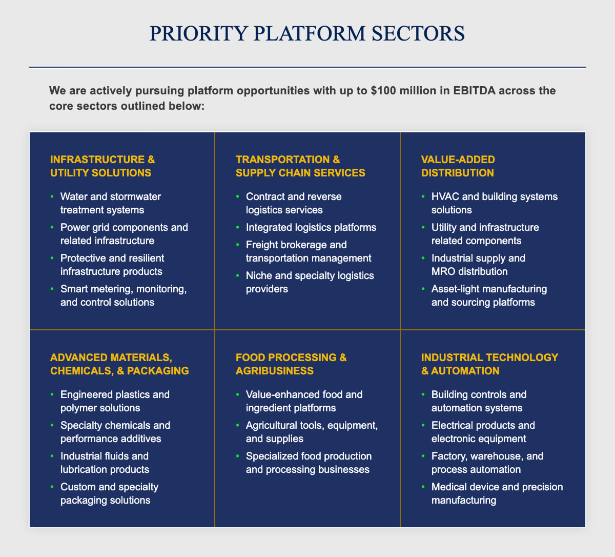
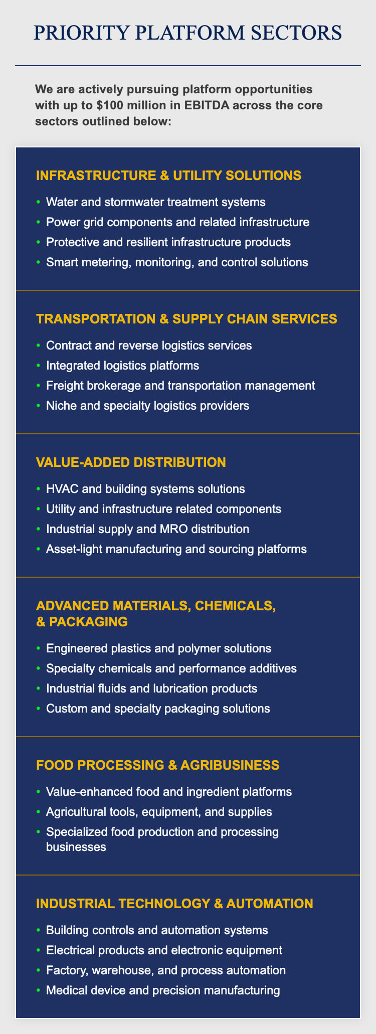
On mobile, the six sector panels shift from a three by two grid into a single‑column stacked layout, making the section easier to scan on smaller screens. The headline and intro copy remain at the top, while each card expands to full width with adjusted spacing, padding, line breaks, and slight font size increases in selected areas for better readability. This simplifies the dense desktop layout into a clearer vertical flow while preserving hierarchy and visual consistency.
On mobile, the card shifts into a single‑column layout, with the headline and intro content kept at the top and the testimonial section reworked into a vertical stack. The quote and portrait move from a side by side arrangement into a centered top to bottom flow, while the CTA is placed below as a full width action. Spacing, padding, and selected font sizes are slightly adjusted to improve readability and keep the block clear and visually strong.
3 Days + Responsive + Retina Ready + 50% off your first order.
A smart start for your next project.
Responsive email already includes a mobile version. It is created by adapting the desktop email to give the layout a cleaner, more readable structure that feels more natural and comfortable on smaller screens.
These modifications are made possible by media queries. They allow previously defined CSS styles to be overridden, making it possible to adapt the content more precisely for a mobile version that works better in email.
Our internal coding standard also plays an important role. Every template is hand coded using only what is necessary, which keeps the structure compact and gives us the flexibility to implement almost any email design idea.
This is a default expectation for every project. It means the email developer aims to recreate the design with pixel level precision and ensure it appears as consistently as possible across different email clients.
Improved readability across devices reduces the need to zoom or scroll sideways. It helps keep mobile readers engaged and can improve results by delivering a smoother experience.
See full email templates side by side in their desktop and mobile versions. In many cases, only the desktop email design is needed to get started. During coding, an email developer can build the mobile version based on responsive best practices, helping reduce design effort while still delivering a polished mobile experience.



Have questions about responsive email templates?
Browse the FAQ for clear answers on mobile adaptation, responsive coding, desktop‑to‑mobile design decisions, ESP preparation, mobile testing, and Outlook support.
Yes. Responsive email is now a standard solution, not an experimental one. A strong mobile experience is a practical requirement because a significant share of email opens happens on smartphones. When an email is adapted for smaller screens, it becomes easier to read, easier to engage with, and more likely to support the goal of the campaign.
We first consider any recommendations or mobile design provided at the order stage. If mobile adaptation is left to our judgment, we focus on keeping text comfortably readable, reducing internal spacing to make better use of limited screen width, and preserving the visual identity and overall feel of the original design. When needed, nonessential decorative elements may be reordered, simplified, or hidden to create a cleaner, more balanced, and more effective mobile experience.
In many cases, a width of 375px is a practical starting point for mobile design. We recommend keeping text at 12px or above so it stays readable on smaller screens. A mobile version should not be treated as a scaled‑down desktop layout, since content blocks may need to stack or reflow. Preparing images for 2x export also helps support proper Retina Ready Images.
Yes. We can rebuild an existing email template as a responsive one based on our coding standards. Clients may provide a template they already use or a reference email they like. This gives them a cleaner implementation, better control over the mobile version, and a more reliable result across email clients. It also creates a stronger foundation for future updates and improvements.
Yes, in many cases we can. Complex desktop sections often require a more thoughtful mobile treatment, but they can still be adapted without losing clarity. If any part of the layout raises concerns, we usually point it out in advance and recommend the most suitable direction. After the build, we can also refine the mobile version where needed to better align it with your expectations and goals.
Yes, but the best approach depends on the design and the goal of the email. In some cases, large tables or dense content sections can be fully adapted for mobile. In others, the better solution is to show only the most important part, create a preview that leads to the full version on a website, or provide the complete content as a downloadable PDF. The right solution depends on the structure of the content and the practical limits of email clients.
No. We start with the most compact email code possible while still keeping the template reliable across a wide range of email clients. A mobile version is not a separate hidden template. It is the desktop version adapted through responsive CSS to work better on smaller screens. Because of this, responsive coding usually adds only the rules needed for mobile behavior rather than duplicating the entire template.
We use both real device testing and professional email testing tools before delivery. Real devices let us review the mobile version on iOS and Android smartphones and tablets using installed email apps and live sends. We also use a dedicated testing platform to expand coverage across a wider range of inbox environments. Together, this gives us a more reliable view of rendering and helps us catch important issues before handoff.
Yes. In most cases, a responsive email template can be used inside your ESP, especially when the platform supports custom HTML import. We can also prepare the template for your ESP’s requirements, so it imports more smoothly, remains editable where possible, and keeps its intended structure and responsive behavior more reliably. This lets you keep using the ESP you are comfortable with while getting more control than a standard builder usually allows.
Yes. We build responsive email templates on a table‑based structure that stays reliable across older email clients, including older Outlook versions. This helps preserve a consistent desktop version where broad compatibility matters most. In Outlook for iOS and Android, media queries are supported, so the template can switch to a modern mobile version on smaller screens.
Tell us what you have and what you need. We'll help shape your order so you can move forward with confidence.

